The introductory seminar course ‚Geovisualization and Advanced Cartography‘ was centred around the communication of geographic information through maps and other types of cartographic representations, dealing with map design, methods for map making, and the application of theories and concepts in practice.

The course was designed around three projects. The projects covered selected topics of geovisualization and thematic cartography ranging from thematic mapping, to web-based mapping and additional forms of representation in cartography. After revising and acquiring mapping skills, these skills were applied in an investigative geovisualization project.
The topic of the first project was the creation of a basic interactive web map using HTML, CSS and JavaScript Leaflet. The second project was focused on the visual presentation of bike sharing data in Boston, Massachusetts using the Tableau software. Our task was to try out and use different types of (cartographic) illustrations for the presentation of the data. After completing the two previous projects we were allowed to choose our own method and topic for the last and final project. For this final project I chose to again create a web map. But this time more emphasis was placed onto integrating advanced plugins. The results of the three projects will be presented in the following sections.
Creating the Salzburg Fortifications Map
The first project in the course was a mandatory web-map based on JavaScript and Leaflet. The goal was to find a suitable topic as well as data sources. Then, a basic web-map should be created that contained basic forms of interactivity. The use of third-party plugins was also requested.
In my case, I decided to create a web-map that should show the route of the historic city fortifications of Salzburg, including the medieval city walls, watch towers, gates and later modifications, such as the early-modern bastions. These datasets should be layered on top of various basemaps (orthophoto, street layout, terrain model). The map users should be able to explore the data by comparing the historical fortifications with the current city infrastructure. Popups and the ability to select the transparency should increase the interactivity and lead the users to explore the datasets.
As no such datasets were available, I was forced to first find a historic map and then digitize the relevant information. Then I had to decide which information I should include in the attribute table. In the end, I decided to include the year of construction and the building type. This would allow me to colour the features accordingly. The second step was the creation of the web-map itself. The result can be seen as image below or through the link.

BLUEbikes Data Visualization
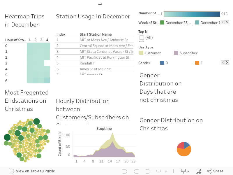
The second project was focused on the exploration of bike data by using interactive tools and (geo)visualization techniques available in the Tableau software. The dataset to be visualized was created and published by the company BLUEbikes which operates a bike sharing service in the metropolitan area of Boston, Massachusetts. Users can rent bikes by joining a monthly or annual membership plan or by paying for single trips. The concept enables users to use any available bike in the service area while the pass or membership is active. After the ride the bike can be returned to any station. As the traffic data contains a variety of variables, interesting visualizations can be made.
The timespan selected for the further exploration and visualization was set to December 2019 with the hypothesis that the trip usage would change significantly with the Christmas holidays and that these patterns would be visible in the dataset provided. The year 2019 was chosen, as the ongoing Covid-19 pandemic is influencing the movement pattern of people and probably superimposes the effect of holidays on the trip data.
Five different charts were created:
- The first chart was a heatmap of the trips in December which compared hourly bike usage numbers on every day in December. The heatmap was chosen, because it provides a good overview of temporal changes.
- The second chart was a simple bar chart of the stations usage in December filtered by weeks, so comparisons can be made between different stations
- The third chart was a packed bubbles chart visualizing the most frequented end stations on Christmas (25.12.).
- The fourth chart was a discrete area chart to show the hourly distribution between customers and subscribers on Christmas (25.12.). This chart showed surprising patterns that service subscribers were more active at night and over the whole day, while customers were mostly active between 10am. and 20pm.
- The fifth chart was a pie chart showing the gender distribution of bike users on Christmas (25.12.).
The result of the assignment is available as here or as embedded HTML below.
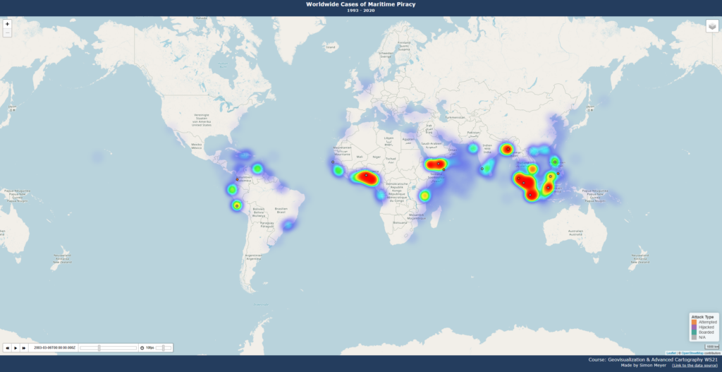
Creating the Maritime Piracy Map
The topic for the last project could be chosen by the participants themselves and could be a web map with animations or an exploratory spatial data analysis similar to the BLUEbikes bike sharing project. As web maps are an interesting tool for spatial data visualization, I chose the web map. This time I decided to focus on spatiotemporal data visualization. For this task the dataset ‚Global Maritime Pirate Attacks (1993–2020)‚ on Kaggle was used. The dataset contains information from more than 7.500 maritime pirate attacks that took place between January 1993 and December 2020, as well as country indicator data for the same time period. The pirate attack data was collected from the International Maritime Bureau (IMB), tidied, and augmented with geospatial data. As piracy data has interesting geographic patterns, the visualization as a web map was obvious.
Visualizing temporal changes has always been a challenge for traditional cartographers, as traditional map space was not dynamic, and markers could not simply appear and disappear. Modern web maps however can change dynamically, which provides unprecedented opportunities for (digital) cartographers. This means, that new ways have been enabled to visualize large quantities of data without having to reduce content to ensure the readability of the map.
The goal of this project was to create an interactive leaflet map, that visualizes the cases of worldwide maritime piracy. Incidents should be visualized by the means of a time slider that shows all cases around a certain date. By that, users should be able to scroll through time and explore individual cases. Pop-ups should provide additional in-depth information about individual incidents, showing the vessel name, type of incident and more detailed information about the attack itself. The markers of the incidents should be coloured according to the respective attack type. To support the explorative capabilities of the web map, a heatmap should be implemented which locates hotspots of piracy based on the dataset, as well as geographic boundaries of the 200 miles Exclusive Economic Zone (EEZ). These layers should function as optional selectable layers in the layer switcher.
The results of the final assignment can be seen in the web-map and in the static image below.